
By default, your Echo Show‘s screen is covered with suggestions and other sponsored content. That makes the screen look messy. But you don’t have to unplug it. Instead, you can get rid of these recommendations and make it all look nice and tidy, just displaying current time.
Let’s go to your main interface. It has a bunch of quick access icons for smart home controls or music, all kinds of widget, etc. There’s probably more stuff on there than you need. Oh, look, it shows your Spotify playlist in the corner too. It is more visual noise.
Disable Home Content Recommendations
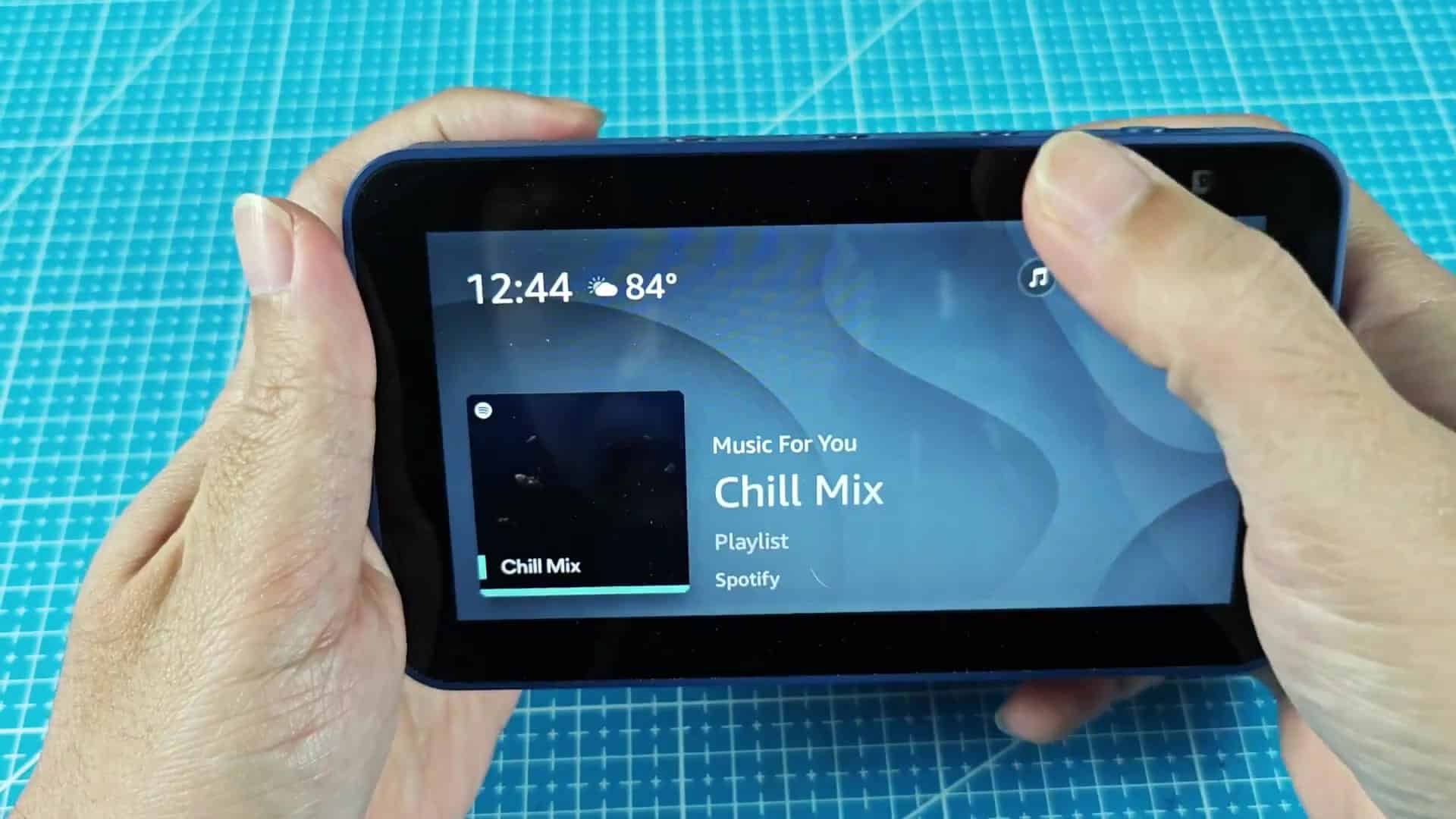
Swipe down to hide it. You know what happens next? Yes, that swipe gets you behind the layer, swiping down opens the quick settings panel.
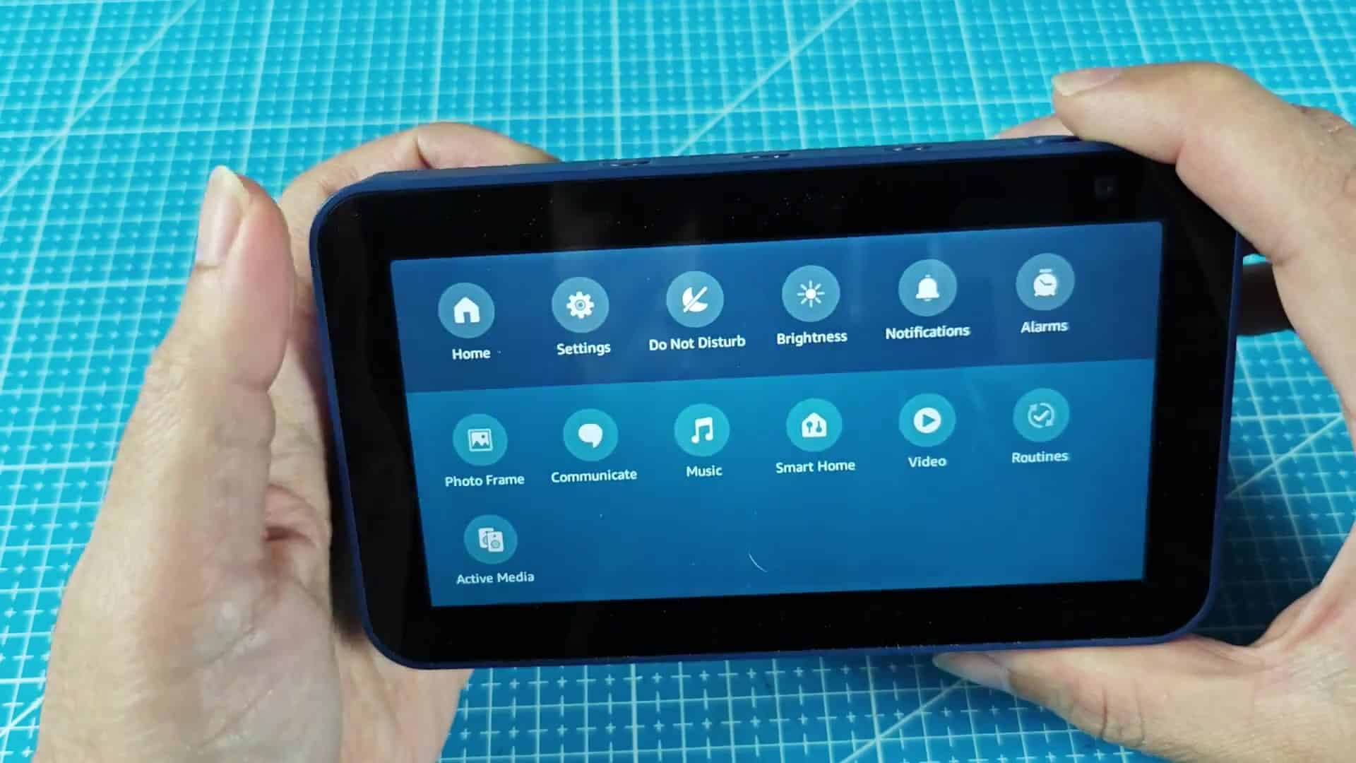
Swipe down to get behind that layer. That gesture open the quick settings panel.
From here you’ll want to head into system configuration section. At first glance, it just appear as a regular list of settings, but that’s where everything lives.
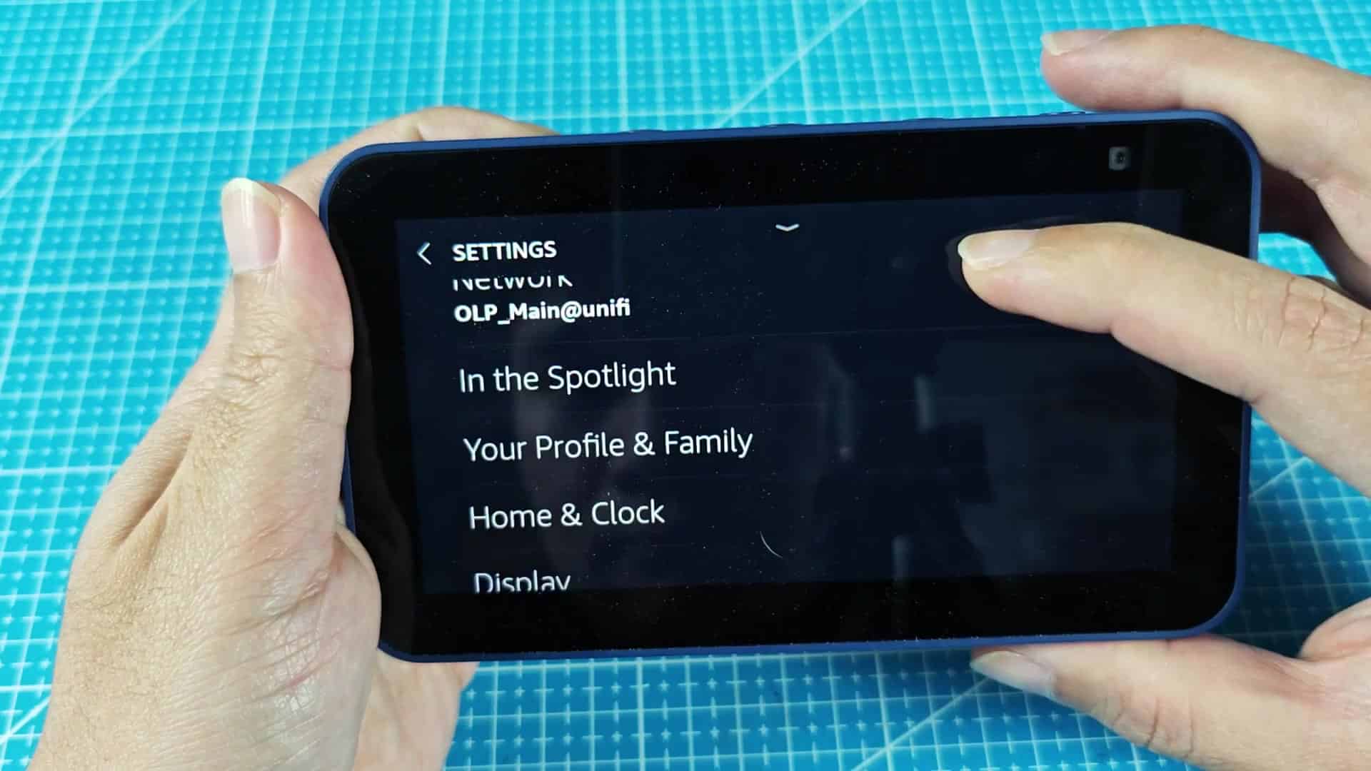
Up towards the top of the settings you can find your network info and Bluetooth status, which won’t help you with this quest. Skip over those, you need to dig a little deeper. It’s not the most intuitive layout, so scrolling around for a bit will get you there.
Bluetooth status and network information appears near the top.
Keep scrolling through main settings categories. Next up are Display and Sound options… These don’t address content filtering.
Further down, you’ll see a Home & Clock option. Tap that, too. This is where you can customize your interface. It is a good sign we are headed in the right direction. Now you’ll see more specific choices, with the menu expanded:
Click through and find Home Content in that sub menu. That’s the master switch of what will show up on your screen. By default, it’s set to display a combination of recommendations, ads and news.
Click on the option to control them. You’ll see a list of toggles, one toggle for each kind of content. Turn off all of them to quickly empty out the list. This instantly changes look of the home screen entirely. The clock is big and easy-to-read, while the suggestions and banners are gone from sight. It goes from a messy look to a simple one.
It’s a smart hub that can still be used as such without demanding your attention. That eases some of visual clutter.
The settings are baked into the software and turning them on/off takes just a couple of taps. No need to download an app or any other special tool. The setting remains toggled until you change it and doesn’t require resetting every day.
If a calming visual environment for the start of your day sounds good, this will work for you.
It looks cleaner. Without the distractions, it’s a lot cleaner to look at. It does its job as a kitchen clock and you can clearly see what time it is right away. If you do want the smart stuff, it’s hidden out of sight. No more annoying promos disrupting your day.
If you’re feeling bombarded by the default experience, and many are, give this a try. It’s easy to let things like ads slide in with the ecosystem, but it’s also easy for you to dictate what shows up on your screen.
Spend a minute tweaking the settings, the changes go through fast and could of been undone just as easily. The new look will make you happy.